Círculo de crédito
Circulo de credito is a company that compile, process and manages credit information of people and companies in Mexico. Their purpuse is to facilitate the access to the information of people, financial institutions and other credit providers, always under regulation.
The credit agency of SMEs.
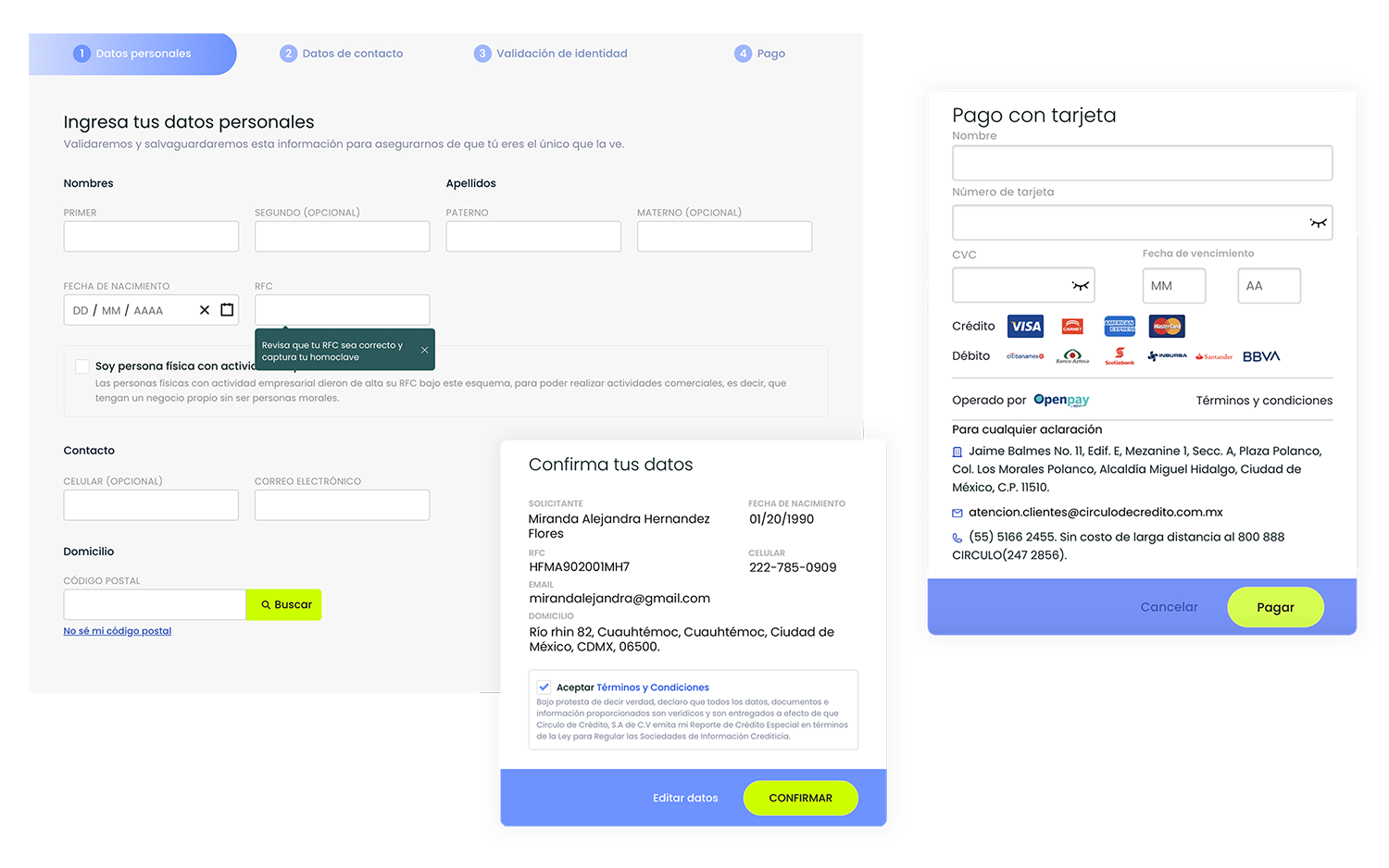
The project was part of a marketing strategy that sought to improve online sells of digital key products like credit report and score. Under agile approach, i set up design standars that allowed me to create visual hierarchys, reusable components and information architecture that optimized navigation and the access of key products through mobile devices mainly. Facilitating digital onboarding process of clients, identity validation and online payment process, we're adding more payment methods and help tools like video tutorials and online support in critical phases of the process.
Challenge
The challenge was design for a very diverse user segment, between 25 and 65, with different levels of education and varied financial context. Their needs was closely related to their habits and generational behaviours, this involved differences in their relationship to technology, their financial habits and the level of confidence in digital services.
Design Process
I started the UX process with a deep research that included UX personas, usability testing in existing flows and interviews with users of different generational segments, with the prupose of knowing the financial context of users, comfort level in technology and test usability in mobile devices to indetify and prioritize the most critical friction points.
From this, i identified errors in the existing user flow that affects experience and navigation on the site, so they generated part of drop out rate. The most relevant findings were:
Very limitated navigation and lost of visual consistency - The navigation wasn't clear, the important CTA's were misplaced and the process lacked of a defined structure.
Limitated payment methods - Few payment methods and technical issues prevented transactions from being completed.
Specific issues by user segment - Older users avoided scrolling and required clearer instructions to move forward.
Unclear identity validation process - Third-party service generated a lot of friction, causing many users to leave the flow.
Solution
Based on research insights, i implemented a number of improvements focused on clarifying the process, reduce the friction points detected and optimize usability:
More payment options - Integration of additional payment methods such as SPEI transfers and bank deposits, ensuring each experience was clear and secure. Also included secure transaction stamps and certifications such as CONDUSEF to build trust in user minds.
Optimization of visual architecture and navigation - A style guide was defined that established clear hierarchies in buttons, titles and texts, improving the site structure. This allowed users to easily recognize the platform and perceive it as reliable.
Better adaptation to different user segments - Unnecessary scrolls were eliminated and worked with marketing team in tone of the message, avoiding complex financial or technological terms. The aim was for both young and older users to understand the information easily.
Greater clarity in identity validation - Were added visual elements aligned with each process instruction. For example, if a photo was requested, a corresponding reference image would be displayed, which reduced confusion. All the artwork was designed in-house to ensure a coherent visual identity.
Additional support to reduce friction - We're added support tools such as Whatsapp contact and video tutorials for help users resolve queries without leaving the flow.